Friday 12 December 2014

Dichotomous Character Project: Post Mortem

With the dichotomous character project over I have now had some time to reflect on what happened during the project. If I performed well, what could be improved upon, what I should take from it and what I would change if I were to do it again?

In terms of meeting the brief and achieving what it specified in the time given I would say that I had done a good job. The goals of the project were to design the 2 characters before modelling and texturing with no limits on creative and production choices for the project. I achieved that and many of the stretch goals of the project were met so I ticked that box but I probably suffered for trying to achieve some of these goals. I really wanted to animate the character when concepting and because of this I feel like I might have rushed to modelling and rigging stages. I am fairly happy with the time management I used on this project but do think that at times I got distracted in labs which did slow parts of my process down during the creation phase in which if I was concentrating I could have had more time to create a better product.
Kept with original exaggeration
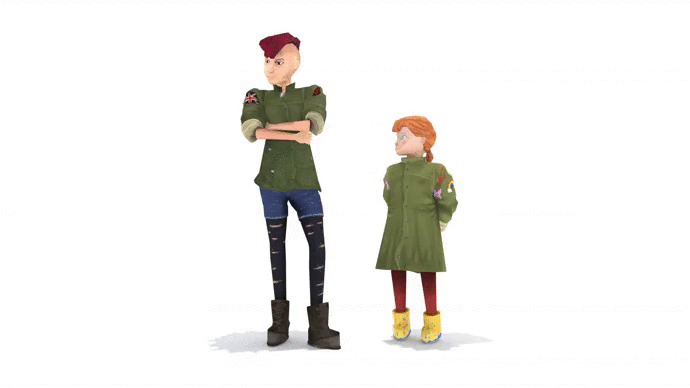
During the concepting phase I feel like i did a good job of finding a direction to the project and pursuing it in detail. I really enjoyed this part of the project and feel that the only thing that really let me down was my technical skill especially when making value and colour choices where I am still learning about it. If I were to change my decision making process I would choose a different head for the older sister because the head I choose looked too masculine. I would choose the helmeted one and push the design to some more extremes with the body having many more scratches and badges as well as some patches.
very quick paint over showing some of the basic changes I could make.

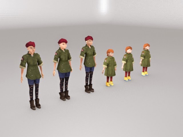
For the model creation phase I think that while it was fun and a good exercise of modelling and low poly modelling skill I think I should have just made one model for each character and focused on making them as high quality while still limiting my tri count.

Overall I would say that I am happy with the project because I worked hard and got some results. It has revealed some massive flaws that I have in my 3D skills that need to seriously be addresses in my opinion. I really need to push harder and have changed some of my personal projects so that there are more 3D based ones over the Christmas period.

Thursday 11 December 2014

Dichotomous Character Project: Part 3

Once I had the concepting essentially finished (there would be minor changes and development throughout production and before texturing) I knew that I could begin modelling the model. However I actually found it hard even with my sketches how the form would work better in a 3 D environment. I decided to look around for reference and actually sculpt the model in a general form to understand how it works.


I made the physical models making a wire skeleton first bore adding the modelling clay. Because of a lack of funds I used resources that I already had and used animation clay which mean that the models cannot dry. The benefit is that they could be posed while the downside is that its  much harder to keep and sculpt finer details.


My next step was actually modelling them. I decided that I would make some low poly models and I also decided that I would make LODs (levels of detail) so that if they were put into a game the engine could save power by swapping in between LODs when far away. My high poly models had an upper limit of 6000 tris (triangles) but both were much closer to 5000 tris. My mid poly models were 2000 tri models and my low poly ones were 1000 tris. From this first model attempt I realized when feedback was given that the topology on the faces could be adjusted but also that the cheeks were too rounded for my Jamie Hewlett art style and I had to sharpen up.


I fully rigged and textured all my LODS and models. They had diffuse and normal maps. I decided against secular maps because the light information would be painted into the textures. For some reason in renders the seams on the textures showed up much more then in viewport and engine.


I then quickly made an idle animation for the pair with the little time I had left. There were still some deformation issues that couldn't be sorted out on time but I had finished the project and everything I had set out to do had been achieved to some degree.


Dichotomous Character Project: Part 2

Once the basic research had been done and I had a firm base for the project and once I had that base I could move on towards designing the character.


I decided to start with designing the heads because I already had a fairly good idea of how I would make their body differ and I wanted to focus on the head because It is an important part of how we read emotions and what a character be like ( not to say the rest isn't just as important). I started with general heads from either one before focusing on each of them individually and eventually decided.


Once I had the heads I moved on the the bodies and looked at having opposing shapes into the bodies with an inverted triangle for the tall stretched out sister and a squat triangle for the little sister that would be more rounded. I also made a mood board around this time comparing punks to little girls to look at clothes styles. Even with the mood board I had a hard time deciding what the little sister should wear and eventually looked towards my own sisters interactions and remembered that when my older sister left home my little sister would often make raids into the former's room and "borrow" the clothes left behind. This gave me the idea that the little sister would actually aspire to be a punk like the older sister but fail because of her naivete by wearing wellies instead of boots, having the clothes not torn up and badges of happy things that she liked rather then that other things the sister wore.


Once I had decided pretty much what they would look like I developed some sketches of them in a pose that helps to illustrate the ways in which they are different. As well a physical attributes I know from my background in drama that the main parts that make characters interesting a different are attributes like the gait (walk) of a character. The inclination of the head and body tension all of which should also be considered when designing a character just as much as when acting or animating. I had to think about the characters personalities which is something I always thought about throughout the project and what kind of person they would be like. In this pose you can see the laid back nature of the older sister coming through in the non-nonchalant walk as the energetic enthusiastic little sister strides with purpose in front with arms out high with small tight fists.


After I had a pose I knew I still had to further develop the concept so I could model it. I wanted to make orthographic but my first attempt was pretty weak so I set about drawing the character from multiple viewpoints to build up how they work. I also experimented with some other ways of posing the characters so I could explore them in more depth.


I then made some quick pose of them interacting which would be the basis of the idle animation I would make as a stretch goal. I also remade my orthographic images because they were still filled with lots of errors that would make it impossible to model from them. I also made some adjustments to the head front view to make it more interesting.


During and after this development process on paper I was also looking at values and colour in the digital format deciding to go straight into so more polished pieces to see what I would get before going into thumbs. I made a colour reference board from pictures in my mood boards and then took swatches for potential colours to use. I have struggled with digital work for a while and still don't quite have the hang off it.  knew after this that I still had alot of development of values before colour could be tried out.


I developed the values first before moving on to choosing the colours. I wanted the little sister to have lighter values and the older sister to have darker values to contrast between their personalities and styles while still having a gradient running throughout them that brought your eyes up to their head (following the dota 2 art guide). Character contrast was also experimented with in the colours as well with the elder sister having more desatutrated colours and the younger sister having increased saturation. I still wanted them to meet together somehow so I decided rather then colouring the little sisters jacket differently it would be the same color just at a lighter value.